-
How to override the default DataFrame preview in Python in Excel
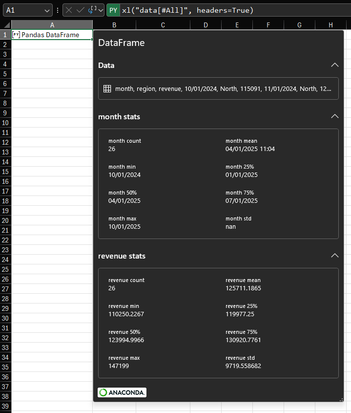
Continuing from last week’s post about custom card views of Python objects, this post will describe how you can override the default card preview of a Pandas DataFrame. By understanding how this is done for one example, you’ll be able to override the default card preview of any Python object in Python in Excel. The default card for a DataFrame This post is using the same data as last week: The default card preview for a DataFrame looks like this: As you can see, we have some information about the number of rows and columns and a preview of the…
-
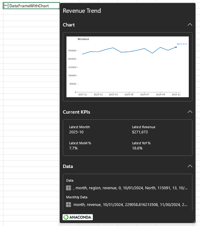
How to customize card previews for Python in Excel
Data The examples in this post will focus on an artificial dataset of revenue by region and month for the 13 months between October 2024 and October 2025. For purposes of demonstration and discussion, there are two regions. Here is a sample: If you want to follow along, use this formula to load the data to your workbook. Paste it as values, then use Ctrl+T to convert it to a Table. Name the Table ‘data’. Introduction To begin with, let’s create a simple Python cell and load the Table ‘data’ into a DataFrame using the xl method: There are two…
-
How to visualize matrix transformations with Python and matplotlib
Guys. You wouldn’t believe how long it took me to figure out the syntax for correctly displaying a square matrix on a matplotlib plot. And you know why it took so long? Because I tried to get ChatGPT to help me. And it kept. Suggesting. The. Same. Wrong. Answer. Over. And Over. Protip: RTFM. Anyway, here’s a neat Excel workbook with which you can visualize the effect of a matrix-vector dot product. Here’s what it looks like when you use it: You can edit the definition of the vector in E3:E4 and edit the transformation matrix in B3:C4 and the…

-
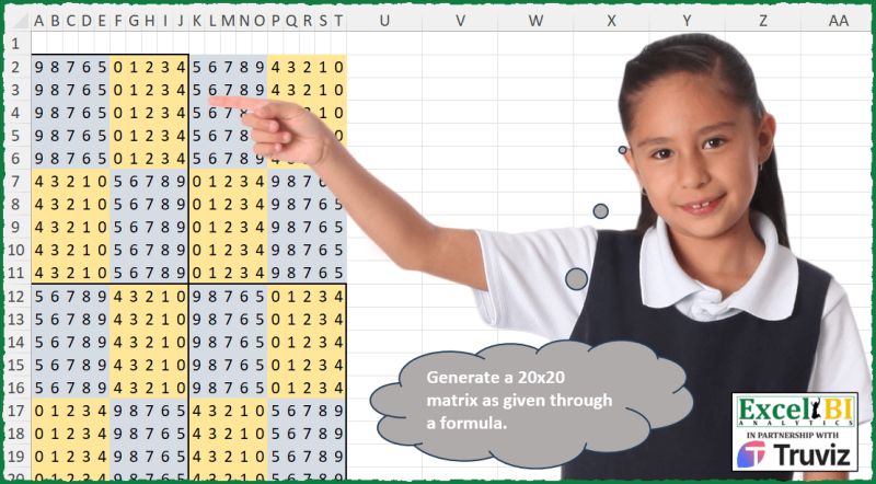
Exploring NumPy operations with a Python in Excel challenge
Here’s a data challenge I saw on a LinkedIn post: My goal was to produce the matrix using Python in Excel. The first thing to note is that the matrix is entirely composed of the integers 0 through 9. So: You can see in the image above that the larger matrix is composed of smaller chunks of 5 integers. All of the grey boxes are the integers 5 through 9 either in order or in reverse order. The yellow boxes are the integers 0 through 4, again in order or in reverse order. So we can define two building blocks…