Data
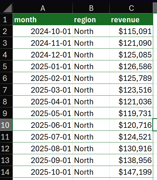
The examples in this post will focus on an artificial dataset of revenue by region and month for the 13 months between October 2024 and October 2025. For purposes of demonstration and discussion, there are two regions. Here is a sample:
If you want to follow along, use this formula to load the data to your workbook. Paste it as values, then use Ctrl+T to convert it to a Table. Name the Table ‘data’.
={"month","region","revenue";45566,"North",115091;45597,"North",121090;45627,"North",125085;45658,"North",126586;45689,"North",125789;45717,"North",123516;45748,"North",121036;45778,"North",119731;45809,"North",120716;45839,"North",124521;45870,"North",130916;45901,"North",138956;45931,"North",147199;45566,"South",113967.816213508;45597,"South",122992.756244634;45627,"South",117852.583377097;45658,"South",130922.368187344;45689,"South",141786.880990267;45717,"South",117009.334752734;45748,"South",122254.394713899;45778,"South",131836.366406664;45809,"South",142409.327246144;45839,"South",110250.226729804;45870,"South",139204.74397967;45901,"South",113298.058024162;45931,"South",124473.993197439}
Introduction
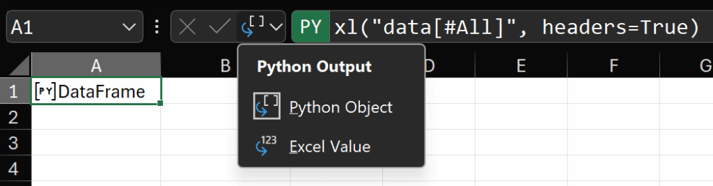
To begin with, let’s create a simple Python cell and load the Table ‘data’ into a DataFrame using the xl method:
xl("data[#All]", headers=True)
There are two output modes in Python in Excel: “Excel Value” and “Python Object”. When you create a Python cell in Excel, you will see the “Python Output” button to the left of the formula bar. Clicking that button enables switching between output modes.
Recall that the result of a Python cell is whatever is returned by the last line of Python in that cell. So, in this example, since the last line (which is also the only line) is a call to xl(), the result is a DataFrame.
When the output mode of the cell is “Python Object”, we don’t see the data in the result of the cell, we see a reference to the object that contains the data. In this case, that object is a DataFrame.
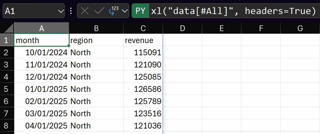
If we change the output mode to “Excel Value”, generally speaking the data in the result object of the Python cell will be represented as an Excel Value. I put represented in italics there because this underscores a key concept for this post:
When a Python object spills to the grid, what we see is a representation of that object
In our simple example, if we use “Excel Value” when the object is a DataFrame, then Python in Excel uses a built-in function, called a repr, to convert that DataFrame into a format that Excel can spill. In the UI, it looks like this:
Going back to “Python Object” mode, when we see ‘[PY] DataFrame’ in the cell, this is also a representation of the object. If we click on the icon in the cell (the icon for a Python cell is ‘[PY]’), we get what’s called a card. This card is also referred to as a preview. For the DataFrame in our example, the preview representation of the DataFrame looks like this:
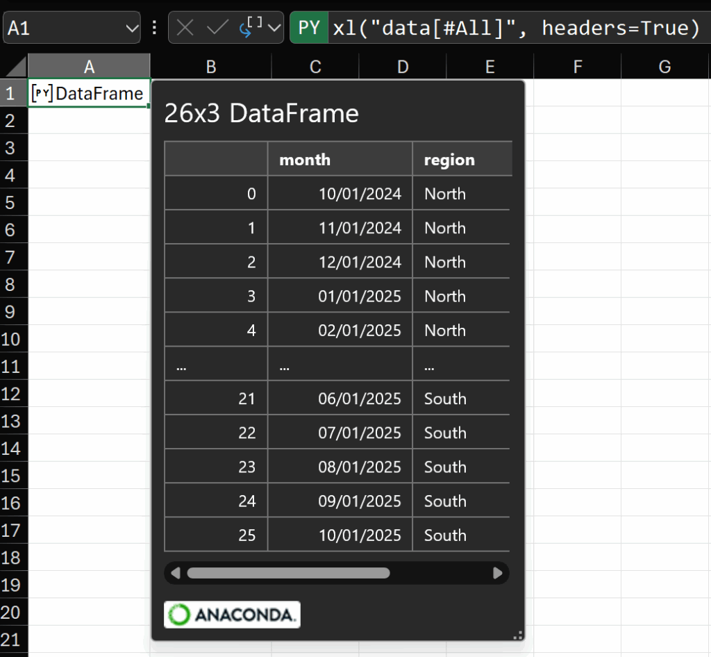
This preview of a DataFrame is presented in the same way for any DataFrame. It always shows the number of rows and columns, the word DataFrame, and then a preview of the data itself – always the first 5 rows, a row of ellipses, then the last 5 rows.
This preview is explicitly defined in the function I mentioned above, which is attached to the DataFrame class in the ‘excel’ module (you can see that this module is imported in the Initialization pane accessible from the Formulas tab of the ribbon).
And this brings us to the key point of this post.
We can customize both the Excel Value representation of an object and the card or preview representation of an object.
To explore how, let’s create a simple class to serve some imaginary but not wholly unlikely business request.
The DataFrameWithChart class
Data looking like this example is very common in our place of business. There is always a date column and always a revenue column. There are sometimes other columns, like region, which are present or not depending on the situation.
Regardless of the presence of other grouping fields, the pattern we’ve noticed is that there is always a need for a line chart formatted in a very specific way and the stakeholder always wants to see four metrics describing the total of the most recent date or period:
- Year on Year % change (which is to say the current month’s revenue divided by the same revenue for the same month in the previous year)
- Month on Month % change (the current month’s revenue divided by the revenue of the month immediately prior)
- The total revenue for the current month
Because these requests (the chart and the metrics) are always the same, but they regularly come from different people and in files of different states of readiness (some may already have many sheets of complex calculations), building an Excel template is not the best solution. Instead, we’ll write code to create the chart, calculate the metrics, and expose all of those things along with the data of the dataset itself, in case any further calculations are needed.
The details of the code for this class are not the point of this post, so I won’t go into exactly how it works, but suffice to say that one implementation might look like this.
import numpy as np
import pandas as pd
import matplotlib.pyplot as plt
import matplotlib.dates as mdates
from io import BytesIO
import base64

class DataFrameWithChart:
    """
    Returns the DataFrame with a chart of the Revenue

    Parameters
    ----------
    df : pd.DataFrame
        Input data with at least a date column and a numeric revenue column.
    date_col : str, default 'Month'
        Name of the date column.
    value_col : str, default 'revenue'
        Name of the numeric value column.
    title : str or None, default None
        Optional chart title.
    """

    def __init__(self, df, date_col='month', value_col='revenue', title=None):

        self.date_col = date_col
        self.value_col = value_col
        self.title = title

        self.df = df.copy()
        self.df[self.date_col] = pd.to_datetime(self.df[self.date_col], errors='coerce')
        self.df[self.value_col] = pd.to_numeric(self.df[self.value_col], errors='coerce')
        self.df = self.df.dropna(subset=[self.date_col, self.value_col]).sort_values(self.date_col)

        _month_bucket = self.df[self.date_col].dt.to_period("M").dt.to_timestamp("M")

        monthly = (
            self.df
            .assign(_month=_month_bucket)
            .groupby("_month", as_index=False)[self.value_col]
            .sum()
            .rename(columns={"_month": self.date_col})
            .sort_values(self.date_col)
        )

        self.latest_revenue   = float(monthly[self.value_col].iloc[-1])
        self.latest_month     = monthly[self.date_col].iloc[-1]
        self.latest_mom_change = monthly[self.value_col].pct_change().iloc[-1]
        self.latest_yoy_change = monthly[self.value_col].pct_change(periods=12).iloc[-1]

        self.monthly_data = monthly
        self.fig, self.ax = plt.subplots(figsize=(8, 4), dpi=120)
        self.ax.plot(monthly[self.date_col], monthly[self.value_col], linewidth=2)

        self.ax.set_ylim(bottom=0, top=self.latest_revenue*1.1)

        for spine in ['left', 'top', 'right']:
            self.ax.spines[spine].set_visible(False)
        self.ax.grid(False)

        self.ax.xaxis.set_major_formatter(mdates.DateFormatter('%Y-%m'))
        interval = max(1, len(monthly) // 6)
        self.ax.xaxis.set_major_locator(mdates.MonthLocator(interval=interval))
        self.fig.autofmt_xdate(rotation=0, ha='center')

        self.ax.spines['bottom'].set_color('#999999')
        self.ax.tick_params(axis='x', colors='#333333')
        self.ax.tick_params(axis='y', colors='#333333')
        self.ax.set_xlabel('')
        self.ax.set_ylabel('')

        last_x = monthly[self.date_col].iloc[-1]
        last_y = float(self.latest_revenue)
        last_label = f"${last_y:,.0f}"

        self.ax.scatter([last_x], [last_y], color='#2F6FED', zorder=3)
        self.ax.annotate(
            last_label,
            xy=(last_x, last_y),
            xytext=(5, 10),
            textcoords='offset points',
            ha='left',
            va='bottom',
            fontsize=10,
            color='#2F6FED',
            bbox=dict(boxstyle='round,pad=0.2', fc='white', ec='none', alpha=0.85)
        )

        if title:
            self.ax.set_title(title, loc='left', pad=12, fontsize=12)

        self.fig.tight_layout()

        plt.close()

    def _convert_chart_to_base64(self):
        buf = BytesIO()
        self.fig.savefig(buf, format="png", bbox_inches="tight")
        data = base64.b64encode(buf.getvalue()).decode("ascii")

        return data

    # Tell Excel to spill the whole DataFrame when in Excel Value mode
    def _repr_xl_value_(self):
        return self.df

    # Define the preview card
    def _repr_xl_preview_(self):
        props = {
            "Title":   "Revenue Trend",
            "Chart":   {
                "type": "LocalImage",
                "image": {
                    "type": "png",
                    "data": self._convert_chart_to_base64()
                }
            },

            "Latest Revenue":  {"type": "Double", "basicValue": self.latest_revenue, "numberFormat": "$#,##0"},
            "Latest MoM %":  {"type": "Double", "basicValue": self.latest_mom_change,    "numberFormat": "0.0%"},
            "Latest YoY %":   {"type": "Double", "basicValue": self.latest_yoy_change, "numberFormat": "0.0%"},
            "Latest Month": {"type": "String", "basicValue": self.latest_month.strftime("%Y-%m")},
            "Data": self.df,
            "Monthly Data": self.monthly_data
        }

        return {
            "type": "Entity",
            "text": "DataFrameWithChart",
            "properties": props,
            "layouts": {
                "card": {
                    "title": {"property": "Title"},
                    "layout": "Entity",
                    "sections": [
                        {"layout": "List",
                        "title": "Chart",
                        "properties": ["Chart"],
                        "collapsible": True,
                        "collapsed": False
                        },

                        {"layout": "TwoColumn",
                         "title": "Current KPIs",
                         "properties": [
                            "Latest Month",
                            "Latest Revenue",
                            "Latest MoM %",
                            "Latest YoY %"
                            ],
                         "collapsible": True,
                         "collapsed": False},

                        {"layout": "List",
                         "title": "Data",
                         "properties": ["Data", "Monthly Data"],
                         "collapsible": True,
                         "collapsed": False},
                    ]
                }
            }
        }
That’s a lot, so let’s focus in on the structure. This code creates an instance of the class on the sample data then prints the names of the methods (functions) and properties:
# Create an instance of the class
dfc = DataFrameWithChart(xl("data[#All]", headers=True), title="Revenue")

# print the methods and properties of the class
for s in dir(dfc):
    if not s.startswith('__') or s == '__init__':
        attr = getattr(dfc, s)
        if callable(attr):
            print(f"Method: {s}")
        else:
            print(f"Property: {s}")
The result being:
Method: __init__
Method: _convert_chart_to_base64
Method: _repr_xl_preview_
Method: _repr_xl_value_
Property: ax
Property: date_col
Property: df
Property: fig
Property: latest_mom_change
Property: latest_month
Property: latest_revenue
Property: latest_yoy_change
Property: monthly_data
Property: title
Property: value_col
I mentioned above that we can customize how Excel represents our objects. This is done with these two methods:
Method: _repr_xl_preview_
Method: _repr_xl_value_
The first customizes how the preview card is structured and what it displays when we click the [PY] icon in Python Object mode, and the second customizes exactly what Excel spills to the grid when the cell is in Excel Value mode.
Because it’s simpler, and less interesting, let’s start with _repr_xl_value_. The code is:
    # Tell Excel to spill the whole DataFrame when in Excel Value mode
    def _repr_xl_value_(self):
        return self.df
This is about as simple as it can get. All this does is return the original DataFrame, which Excel then spills to the grid. This function could be much more complicated, but for the purposes of this example, it’s enough. In the __init__ method, self.df is assigned its value almost at the beginning, and that value is whatever DataFrame is passed into the creation of the object:
This creates an instance of the class in a Python cell:
# Create an instance of the class
dfc = DataFrameWithChart(xl("data[#All]", headers=True), title="Revenue")
Whenever we do that (create an instance of the class), __init__ is run, and the DataFrame we pass into the constructor is assigned to self.df:
    def __init__(self, df, date_col='month', value_col='revenue', title=None):

        self.date_col = date_col
        self.value_col = value_col
        self.title = title

        self.df = df.copy()

etc.
The rest of the code in the __init__ function is calculating the aforementioned metrics and creating the chart. All of these are assigned to the properties mentioned above.
The preview repr
This class creates an object that returns the data we pass into it as well as a chart and the metrics mentioned above. The card preview looks like this:
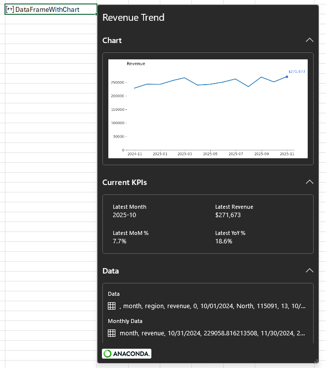
This is the function that defines this card layout:
    def _repr_xl_preview_(self):
        props = {
            "Title":   "Revenue Trend",
            "Chart":   {
                "type": "LocalImage",
                "image": {
                    "type": "png",
                    "data": self._convert_chart_to_base64()
                }
            },

            "Latest Revenue":  {"type": "Double", "basicValue": self.latest_revenue, "numberFormat": "$#,##0"},
            "Latest MoM %":  {"type": "Double", "basicValue": self.latest_mom_change,    "numberFormat": "0.0%"},
            "Latest YoY %":   {"type": "Double", "basicValue": self.latest_yoy_change, "numberFormat": "0.0%"},
            "Latest Month": {"type": "String", "basicValue": self.latest_month.strftime("%Y-%m")},
            "Data": self.df,
            "Monthly Data": self.monthly_data
        }

        return {
            "type": "Entity",
            "text": "DataFrameWithChart",
            "properties": props,
            "layouts": {
                "card": {
                    "title": {"property": "Title"},
                    "layout": "Entity",
                    "sections": [
                        {"layout": "List",
                        "title": "Chart",
                        "properties": ["Chart"],
                        "collapsible": True,
                        "collapsed": False
                        },

                        {"layout": "TwoColumn",
                         "title": "Current KPIs",
                         "properties": [
                            "Latest Month",
                            "Latest Revenue",
                            "Latest MoM %",
                            "Latest YoY %"
                            ],
                         "collapsible": True,
                         "collapsed": False},

                        {"layout": "List",
                         "title": "Data",
                         "properties": ["Data", "Monthly Data"],
                         "collapsible": True,
                         "collapsed": False},
                    ]
                }
            }
        }
Note that for this to work in your own classes, this function must have exactly the same name and argument of self as shown above. If you name the function differently, it won’t work.
Let’s look at the code in a bit more detail. First, we’re creating a dictionary of properties called prop. These properties are those objects that were created during the __init__ function which is run when the class is instantiated.
        props = {
            "Title":   "Revenue Trend",
            "Chart":   {
                "type": "LocalImage",
                "image": {
                    "type": "png",
                    "data": self._convert_chart_to_base64()
                }
            },

            "Latest Revenue":  {"type": "Double", "basicValue": self.latest_revenue, "numberFormat": "$#,##0"},
            "Latest MoM %":  {"type": "Double", "basicValue": self.latest_mom_change,    "numberFormat": "0.0%"},
            "Latest YoY %":   {"type": "Double", "basicValue": self.latest_yoy_change, "numberFormat": "0.0%"},
            "Latest Month": {"type": "String", "basicValue": self.latest_month.strftime("%Y-%m")},
            "Data": self.df,
            "Monthly Data": self.monthly_data
        }
Each property has a Key, (the name of the property) and a Value. You can see that we have Title, Chart, the three metrics, the value of the latest month, the full data (as “Data”) and the data after it’s been aggregated by month (as “Monthly Data”).
Note carefully how the Chart’s value is defined. For this to work in Python in Excel, it must specify type “LocalImage” and it must have an “image” key which itself has a “type” of “png” and a “data” key whose value is the base64-encoded string representation of the image you want to show. This is important! You can’t just pass a matplotlib plot or figure to this attribute. It must be the base64 encoded string. For details of how the figure is converted into that string, see the function self._convert_chart_to_base64().
Note also that for many properties, you can either provide a value, which is the case above for Title, Data and Monthly Data, or if you want extra control over the formatting, like with the four properties whose names begin with “Latest”. For these, I’ve specified their data type and, in three of them, provided a numberFormat as well as the basicValue.
Strictly speaking, the basicValue need only be an expression that returns a value of the type specified, and you can see that for the “Latest Month” property, the basicValue is a formatting function applied to the self.latest_month property of the class instance. Since this returns a string, it fits the format specified.
All of these details may seem a bit random and you may wonder how I came to all these conclusions. The good news is that all of this is part of the Office.js specification for how to create entity cards in Excel (it’s not just Python!), and you can read all the details of how to create properties on this page. I will warn you though, while all the information is there, it’s a little thin on details and not easy to navigate (hence this blog post!).
But let’s press on.
Now that we’ve created a dictionary of properties, we can use them to create an Entity definition that will be returned by the preview repr.
        return {
            "type": "Entity",
            "text": "DataFrameWithChart",
            "properties": props,
            "layouts": {
                "card": {
                    "title": {"property": "Title"},
                    "layout": "Entity",
                    "sections": [
                        {"layout": "List",
                        "title": "Chart",
                        "properties": ["Chart"],
                        "collapsible": True,
                        "collapsed": False
                        },

                        {"layout": "TwoColumn",
                         "title": "Current KPIs",
                         "properties": [
                            "Latest Month",
                            "Latest Revenue",
                            "Latest MoM %",
                            "Latest YoY %"
                            ],
                         "collapsible": True,
                         "collapsed": False},

                        {"layout": "List",
                         "title": "Data",
                         "properties": ["Data", "Monthly Data"],
                         "collapsible": True,
                         "collapsed": False},
                    ]
                }
            }
        }
At the top level of the object above, we have four keys:
- type, which here is “Entity”. There are other types which can be used for more simple outputs, but Entity is most interesting for our purposes. You can read about the other types you can use here.
- text, which is the string that you see in the cell when your Python cell is in Python Object mode, after the [PY] icon.
- properties, which is the dictionary of properties we defined above. We pass them into the Entity definition so excel can show them to us in the card.
- sections, which is how we define the layout of the card and which are documented here.
Let’s look more closely at the sections:
                    "sections": [
                        {"layout": "List",
                        "title": "Chart",
                        "properties": ["Chart"],
                        "collapsible": True,
                        "collapsed": False
                        },

                        {"layout": "TwoColumn",
                         "title": "Current KPIs",
                         "properties": [
                            "Latest Month",
                            "Latest Revenue",
                            "Latest MoM %",
                            "Latest YoY %"
                            ],
                         "collapsible": True,
                         "collapsed": False},

                        {"layout": "List",
                         "title": "Data",
                         "properties": ["Data", "Monthly Data"],
                         "collapsible": True,
                         "collapsed": False},
                    ]
Compare the definition of the sections above with the way the card appears:
In each section we can define a number of attributes that describe what’s in that section:
- layout, which is one of “List”, “TwoColumn” or “Table”.
- title, which is a string and is the text that appears at the top of a section (see in the image “Chart”, “Current KPIs” and “Data”). This property is optional.
- properties, which is a Python list of the string key names of the properties we want to be included in that section.
- collapsible, which determines whether we have the ability to expand and collapse the section. The default value is True if the card section has a title. If the card section doesn’t have a title, the default value is False.
- collapsed, which determines whether the section is collapsed when the card is opened. The default value is False.
Let’s look more closely at the sections one at a time.
                        {"layout": "List",
                        "title": "Chart",
                        "properties": ["Chart"],
                        "collapsible": True,
                        "collapsed": False
                        }
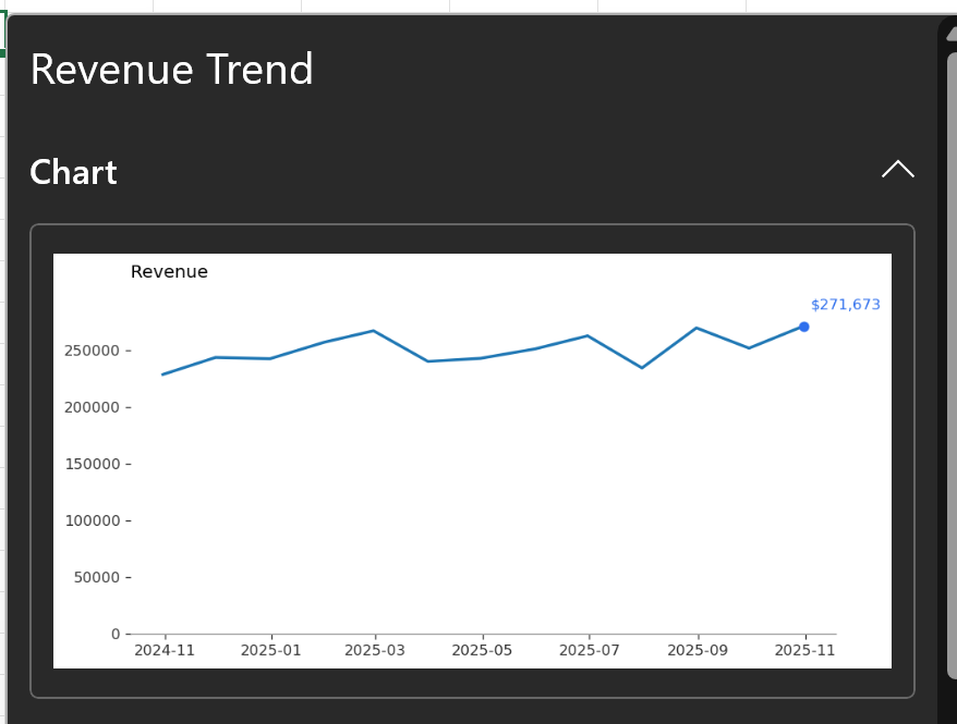
This is the first section. The layout is “List”, which means that whatever properties we have listed in the properties key will be displayed one under another. In this example, we’re only passing the “Chart” property, so only the chart is displayed in the first section.
The definition of the second section:
                        {"layout": "TwoColumn",
                         "title": "Current KPIs",
                         "properties": [
                            "Latest Month",
                            "Latest Revenue",
                            "Latest MoM %",
                            "Latest YoY %"
                            ],
                         "collapsible": True,
                         "collapsed": False},
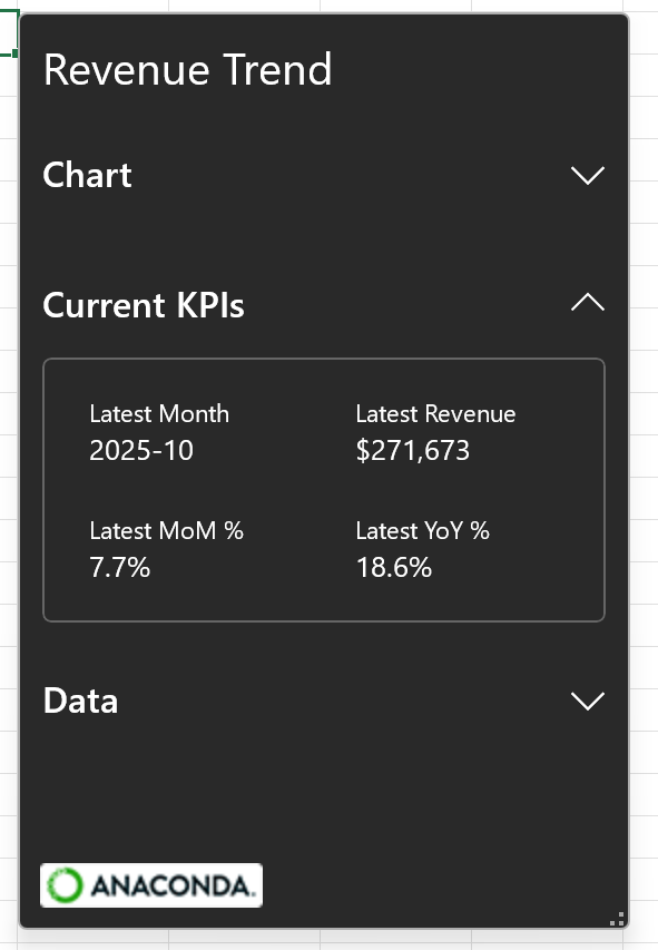
In this second section, the “TwoColumn” layout instructs Excel to wrap the properties into two columns. This is useful when we have a longer list of scalar properties and is perfect for a list of KPIs. It looks like this:
The definition of the third and final section is:
                        {"layout": "List",
                         "title": "Data",
                         "properties": ["Data", "Monthly Data"],
                         "collapsible": True,
                         "collapsed": False},
This is another “List” layout and in this case, because we’re passing two properties which are DataFrames – “Data” and “Monthly Data”, the collapsed version of the DataFrames are displayed in a list, and each of them can be drilled into as you might have seen in Linked Data Types like Currency or Geography:
Summary
In this post we looked at how to configure a custom preview card for a Python Object. Some important things to remember are:
- To customize a preview card, we can include a function called _repr_xl_preview_ in our class definition.
- The return value of the _repr_xl_preview_ function is a dictionary with very specific requirements (see above) that defines the type and layout of the properties we want to expose.
- To customize how data is spilled to the grid, we can include a function called _repr_xl_value in our class definition.
If you have any questions about how this works, please leave a comment and I’ll do my best to answer.
Leave a Reply