Guys. You wouldn’t believe how long it took me to figure out the syntax for correctly displaying a square matrix on a matplotlib plot.
And you know why it took so long? Because I tried to get ChatGPT to help me. And it kept. Suggesting. The. Same. Wrong. Answer. Over. And Over.
Protip: RTFM.
Anyway, here’s a neat Excel workbook with which you can visualize the effect of a matrix-vector dot product.
Here’s what it looks like when you use it:
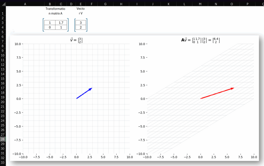
You can edit the definition of the vector in E3:E4 and edit the transformation matrix in B3:C4 and the chart will update to show what the transformation does.
The code for the chart can be found in the Python cell in A5. Also here:
v = xl("E3:E4").values
A = xl("B3:C4").values

x = np.linspace(-10, 10, 21)
y = np.linspace(-10, 10, 21)
grid_x, grid_y = np.meshgrid(x, y)
grid = np.vstack([grid_x.ravel(), grid_y.ravel()])

transformed_grid = A @ grid
v_trans = A @ v

v0, v1 = v[0].item(), v[1].item()
a00, a01 = A[0,0].item(), A[0,1].item()
a10, a11 = A[1,0].item(), A[1,1].item()
Av0, Av1 = v_trans[0].item(), v_trans[1].item()

fig, ax = plt.subplots(1, 2, figsize=(12, 6), )

for i in range(len(x)):
    ax[0].plot([x[i]] * len(y), y, color='lightgray', linewidth=0.5)
    ax[1].plot(*A @ np.vstack([np.full_like(y, x[i]), y]), color='lightgray', linewidth=0.5)
for i in range(len(y)):
    ax[0].plot(x, [y[i]] * len(x), color='lightgray', linewidth=0.5)
    ax[1].plot(*A @ np.vstack([x, np.full_like(x, y[i])]), color='lightgray', linewidth=0.5)

ax[0].quiver(0, 0, v0, v1, angles='xy', scale_units='xy', scale=1, color='blue')
ax[1].quiver(0, 0, v_trans[0].item(), v_trans[1].item(), angles='xy', scale_units='xy', scale=1, color='red')

for a in ax:
    a.set_aspect('equal')
    a.set_xlim(-10, 10)
    a.set_ylim(-10, 10)
    a.grid(False)
    for spine in a.spines.values():
        spine.set_visible(False)


ax[0].set_title(
    rf"$\vec{{v}} = \left\lbrack \genfrac{{}}{{}}{{0}}{{}}{{{v0:g}}}{{{v1:g}}} \right\rbrack$",
    fontsize=14
)

ax[1].set_title(
    rf"$\mathbf{{A}}\vec{{v}} = \left\lbrack "
    rf"\genfrac{{}}{{}}{{0}}{{}}{{{a00:g}}}{{{a10:g}}} "
    rf"\genfrac{{}}{{}}{{0}}{{}}{{{a01:g}}}{{{a11:g}}} "
    rf"\right\rbrack "
    rf"\left\lbrack \genfrac{{}}{{}}{{0}}{{}}{{{v0:g}}}{{{v1:g}}} \right\rbrack = "
    rf"\left\lbrack \genfrac{{}}{{}}{{0}}{{}}{{{Av0:g}}}{{{Av1:g}}} \right\rbrack$",
    fontsize=14
)

plt.tight_layout()
plt.show()
See those horrible set_title lines? Yeah… that stuff is called MathText. And I hate it. There is apparently no built-in way to render a 2×2 matrix, so you have to approximate it with this \genfrac function, which is horrible.
Those familiar with this will probably just say – well, set it to use proper LaTeX and don’t worry about it!
Yeah, tried that. Didn’t work. LaTeX isn’t installed in Python in Excel as of today. Sadface.
Anyway, download the file from the link above. Play around with it. Look at the weird MathText syntax.
Tell me it wasn’t a waste of my time.
Please?
Here’s another Python in Excel post.
Leave a Reply